 Support Ukraine









CoolBox
Woodworking products: machine tools, jigsaws, wood-burning tools
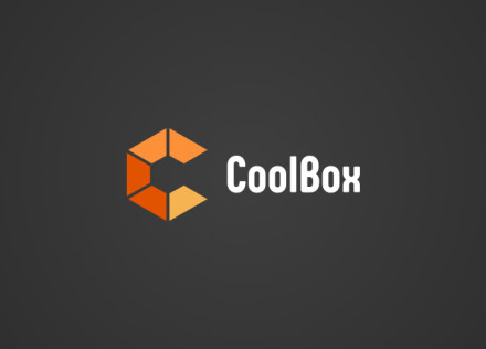
CoolBox is a Ukrainian distributor of products and brands related to creativity, education and woodworking. We developed a logo and visual identity for the company.
We based the brand concept on the image of a box — a simple and straightforward symbol directly linked to the name CoolBox.
The CoolBox logo
The graphic symbol is based on a hexagon with an open side. Inside it, a cube takes shape — a stylised image of a box that visually conveys the brand name.
The geometric symbol with sharp angles contrasts with the rounded shapes of the text part of the logo. This combination creates a balance between the technological nature of the graphic symbol and the brand’s more approachable character.
Colour palette
For the brand identity, we used shades of orange inspired by the natural colours of various types of wood.
The colour scheme reinforces the brand’s connection to the products and materials the company works with, whilst also helping to make CoolBox visually recognisable.
Brand identity for CoolBox
As a result, we have created a minimalist visual system in which form, typography and colour are directly linked to the company’s name and line of business.
The project demonstrates our approach to developing logos and visual identities, where the graphic concept is built around the product, the brand’s character and its business context.
