 Support Ukraine









NanoPack — barrier packaging
Website development and a new corporate identity
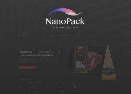
NanoPack is a Ukrainian brand of industrial food packaging that specialises in heat-shrink films for packaging meat, cheese, ready-to-cook meals and other food products.
For NanoPack, we developed a visual identity that conveys the specific nature of the product and makes this technical B2B brand recognisable and understandable to its audience.
The concept is based on combining the properties of the packaging material with the technology used to apply it. This allowed us to build the brand identity around the product itself, rather than relying on abstract graphic solutions.
The NanoPack logo
The logo’s graphic symbol was created as a visual interpretation of packaging film — NanoPack’s core product.
The simple geometric symbol helps convey the character of an industrial brand and functions as a standalone, recognisable element of the brand identity.
Colour scheme
The colour scheme is also linked to the product’s technology. It symbolises the heat treatment during which the heat-shrink film takes on the required shape around the product.
Thus, both the graphic symbol and the colour have a functional explanation and form a unified visual concept for the brand.
Brand identity for a B2B brand
For an industrial product, it is important not only to create a recognisable logo, but also to visually explain the company’s field of activity and establish a professional brand image for manufacturers and partners.
The NanoPack project demonstrates our approach to developing branding and visual identity, where the design is based on the product’s properties, the technology and the company’s business context.

